17 Feb 2025
Organise data with customisable ID formats
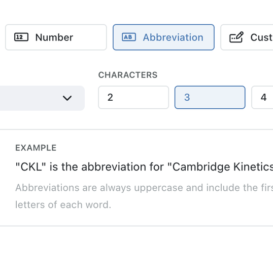
You can now create custom record IDs in Kinabase, including abbreviations and sequential numbers.
Reporting
Get the insights you need to make better decisions. Create custom reports and dashboards to track your business performance, and share them with your team.

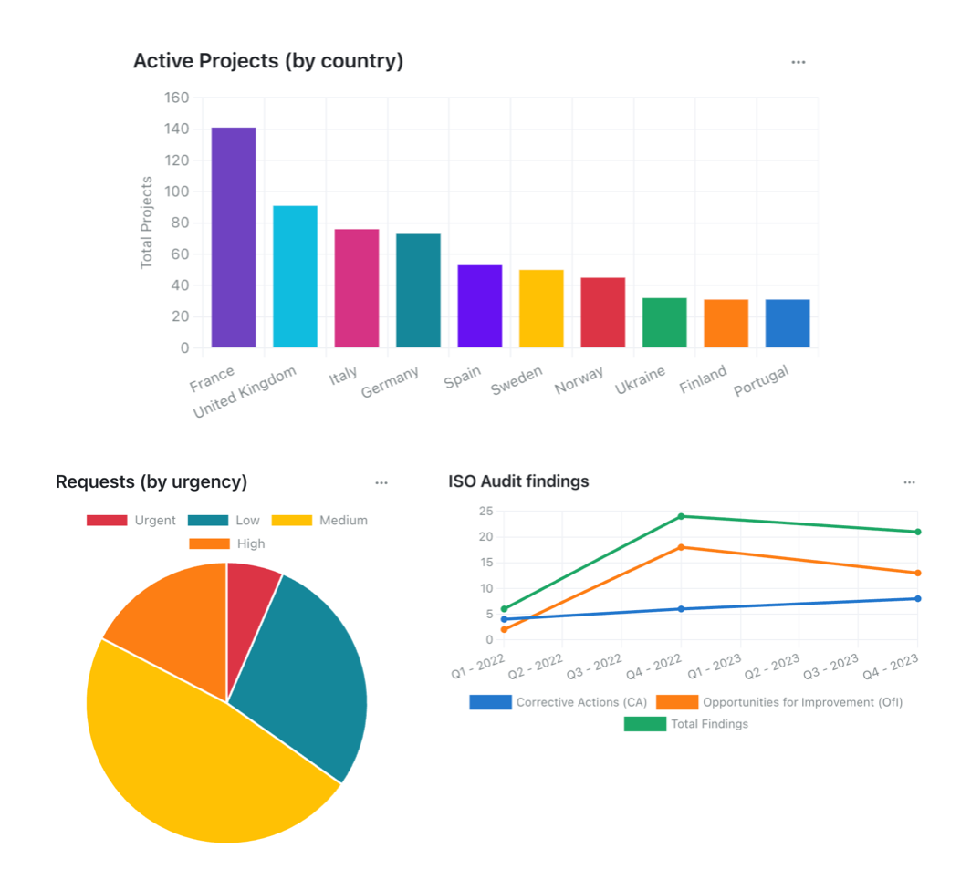
Kinabase's reporting tools allow you to visualise your data in a way that makes sense to you. From line charts and interactive maps, to powerful filtering and grouping, you can find the insights you need to drive your business forward.
Transform raw data into actionable insights with Kinabase's intuitive reporting features. Designed to help you make informed decisions, our tools allow you to visualise the operations of your people, processes, and products through easy-to-understand charts and maps.
You can visualise your data in a way that makes sense to you. Create bar charts, line charts, pie charts, and more to track your business performance.
Whether you're monitoring sales, tracking project progress, or analyzing customer feedback, Kinabase's reporting tools help you make sense of your data.
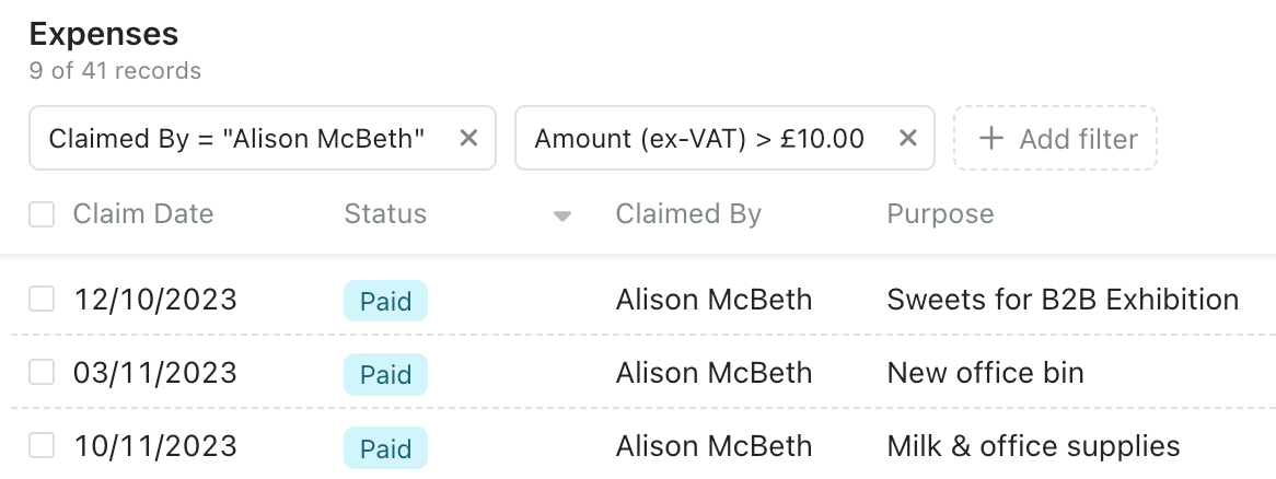
Filter, sort, and group your records with ease. Whether you're organising data by client, date, or stage, Kinabase simplifies these tasks into just a few clicks.
Powerful filters give you answers to questions like:
You can drill down into the details and add multiple filters to get answers to your questions in seconds. Then when you're ready, you can share these with your colleagues effortlessly by creating a quick link.
Even better, inactive records are automatically archived and hidden - to ensure your lists always stay relevant and tidy.
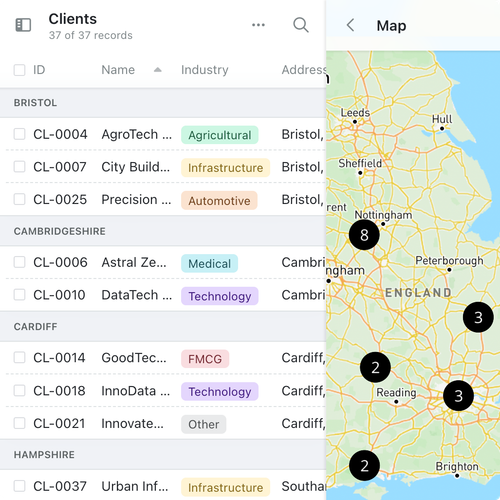
Visualise your clients or supply chain geographically on an interactive map in seconds, and discover where your opportunities lie. Discover instantly where your clients, contractors, suppliers or products are, making optimizing logistics and planning efficient client visits easy.

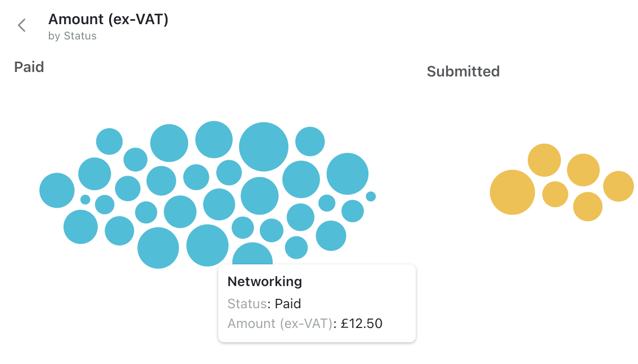
Get a quick overview of your data with bubble charts, and see what's coming down the pipeline. Easily compare the size of your opportunities, projects and more - and identify trends and outliers at a glance.
Customise your bubble chart to show what matters. Size by any numeric value, such as revenue, headcount or sale price. Group by any category, such as workflow stage, industry, or product type. Drill down into the details with a single click.

17 Feb 2025
You can now create custom record IDs in Kinabase, including abbreviations and sequential numbers.
25 Nov 2024
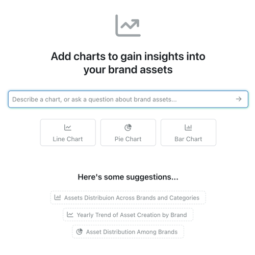
You can now generate, customise, and save real-time charts with AI-powered suggestions, delivering instant insights directly within your collections.
17 Jul 2024
Now you can drill down into your location data to group nearby records together, making it easier to analyse and visualise your data.